|
Cain Project Support Materials for COMP 482 - Fall 2007
COMP 482 Figure Bestiary
| Exhibit
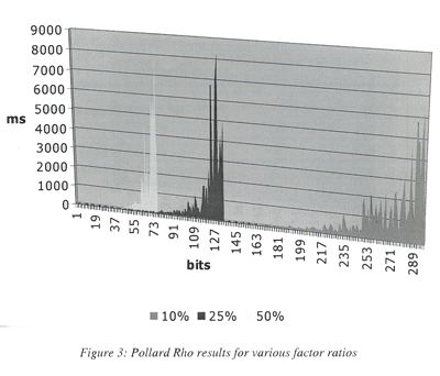
A: Don’t color (or shade) my world |
|
It’s not poor scanning quality or Web resolution that makes
the data in this figure invisible. The actual figure in the paper
is this unreadable. This figure was designed in color, but was
printed in black and white, rendering the thin lines between data
points invisible. In addition, the figure lacks units, comprehensible
labels, and a caption. At the very least, commas between the zeroes
in the Y axis would have been helpful.
Lessons learned:
- Avoid background color or shading
in graphs.
- Follow Tufte’s Rule: Minimize
the ratio of ink to data.
- Choose high contrast elements to
make lines or other relationships between different
subsets of data distinguishable in black and white.
- Clearly label important data points,
axes, and other elements of the figure.
|
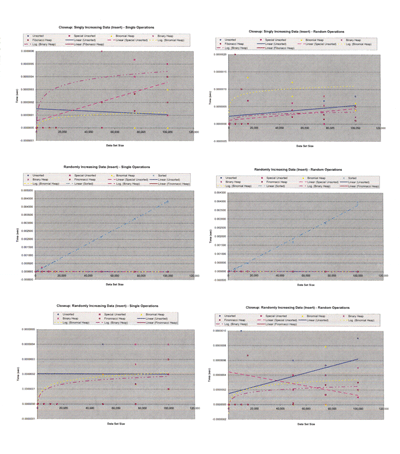
| Exhibit B:
Gratuitous use of graphics software |
|
Graphics programs make it easy to
create all sorts of cool graphs. But the 3D perspective
in this graph not only irritates the eyes, but also
makes the data difficult to interpret. More importantly,
the graph itself does little to help illuminate the
near-zero time data, which comprises a large portion
of the results reported. A log-plot would have helped
resolve the full range of the data obtained.
Lessons learned:
- Pick the right graph for the job.
- Every graph should have a purpose.
Think about what your reader needs to see in order
to understand what you observed and what that led
you to conclude.
- Avoid 3D effects, fill colors,
and other bells and whistles, which may ultimately
confuse or distract the reader.
|
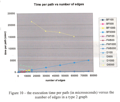
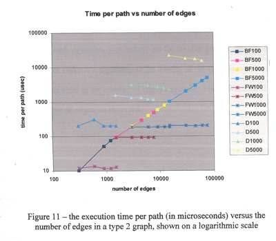
| Exhibit
C: Good use of logarithmic-scale plot to illuminate
near-zero data |
|
|
Many of the
algorithms that you will study in these reports accomplish
their tasks very quickly. A log-scale plot can help
you determine near-zero differences in performance.
The two figures shown here are taken from the same
paper. The team first shows the execution time vs the
number of edges on a regular scale, which reveals general
performance of the algorithms. The team then shows
a log-scale plot, which resolves the data clustered
uselessly at the bottom-left of the first figure.
This team incorporated informative axis labels, a comprehensive
key to the lines displayed, and descriptive captions (not shown).
While the use of color is pleasing, many of the colors have similar
hues that can be difficult to distinguish. And were this figure
to be presented in black and white, it would be incomprehensible.
Lessons learned:
- Log-scale plot can resolve clusters
of near-zero data.
- Labels help readers see your point
by simply scanning the graph.
- Color can be helpful, but use with
caution.
|
| Exhibit
D: May the best data win |
|
If you think this page of charts looks
difficult to read here, it isn’t any easier
to read on an 8 1/2 x 11 sheet. The axis labels are
small, the volume of zeroes on the Y axis makes the
numbers hard to decipher, and no captions are included
to help guide the reader. Moreover, most of the pages
in this report contain four or more figures. Your
reader isn’t interested everything you observed,
just a representative sample.
Lessons learned:
- Less is more. Show only the most
relevant, representative data to support the points
you need to make.
- Make your figures large enough
that they can be easily scanned.
- Always include captions and refer
to your figures in the text.
|
| Exhibit
E a-c: Better analysis through data display |
Ea
- BEFORE
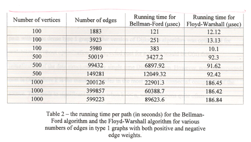
|
Ea-
AFTER
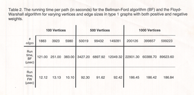
|
Sometimes, a little more
thought to the point you are trying to communicate
can improve your data display. In Exhibit Ea, the
original table from the student report is on the
left. In the discussion about this table, the students
point out the Floyd-Warshall algorithm varies only
with the number of vertices, while Bellman-Ford varies
with both vertices and edges. This variation is difficult
to see in their table, though.
The example above (right) shows one way to reorganize the table
structure to make the variation easier to spot. The reader only
needs to process two rows of data. The column organization makes
it easier to see what’s happening as edges and vertices change.
Aligning decimal points also aids comparison.
|
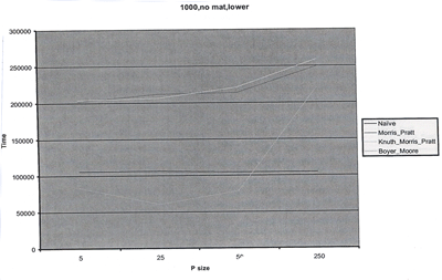
Eb
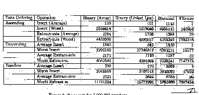
|
The table in Exhibit E-b has too many numbers and headings to decipher.
No units are included, no commas or other delineators are used
to help the reader scan the numbers, and to top it off, the table
doesn’t even fit on the page! A closer look at the figure,
though, reveals that the same four operations are being performed
on each of three ordering functions for each of the four algorithms
tested. This table, therefore, is an excellent candidate for
a bar chart. The four algorithms could be assigned specific shading
or color and their relative performances on each of the ordering
and operation functions could be grouped together along the X
axis, with time running along the Y axis. |
|
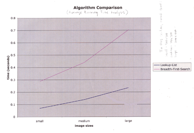
The line graph in Exhibit Ec interpolates continuity between the
data points that is illogical given the chart presentation. The
X-axis doesn’t show a progression, but rather three different
image sizes that are discontinuous entities. This data would
be better presented in a bar chart or on a line chart indexed
by dimension (e.g., 400, 700, 1000) or pixels (e.g., 1600, 4900,
1000000). |
| |
|