Common
Problems in Interpreting and Graphing Data
| Samples 1 & 2
taken from student paper |
(Click on images
to enlarge)
|
| Explanation
of issues and suggested improvements for Samples
1 & 2 |
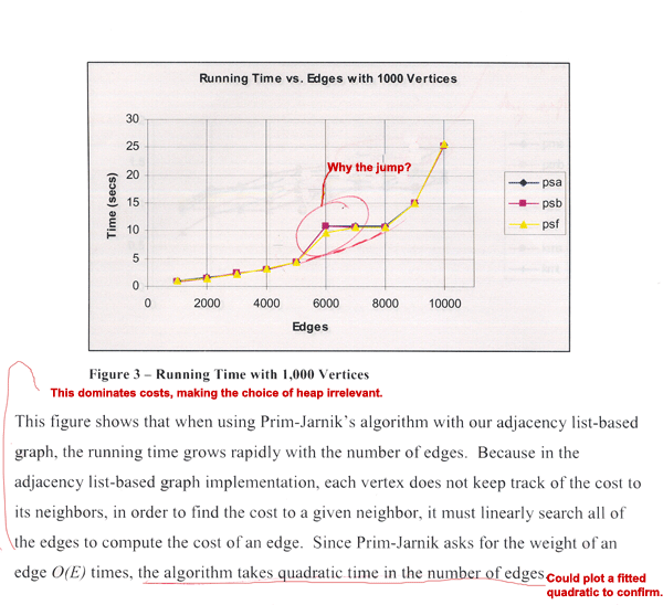
In
the above samples, the students fail to explain key
features of the data they produced. In Sample 1,
the plot lines jump at 6000 edges from a nice curve
that reflects the expected theoretical asymptotic
behavior. Explaining this jump should be part of
the analysis. Potential causes to explore include:
- Atypical
test data at 6000 (and 7000) edges. To reduce
the effects of atypical data, you typically want
to average over several test data of each size.
- Memory
hierarchy effects at this particular data size.
You should be familiar with the details of your
platform's memory hierarchy to be able to explore
such issues.
- Stair-step
data structure that isn’t captured by the
chosen data sizes. Test for this by adding more
data points.
- Data
density issues. Edge density is this case is
increasing while the number of vertices is held
constant. At 6000 edges, the graph may be sufficiently
dense for the algorithm to be significantly slower.
- System
load. Your timings should not include CPU time
spent on other tasks, and you should limit what
other system resources are needed during testing.
This is unlikely to be the cause here since the
behavior is consistent across algorithms.
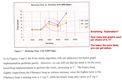
In addition to failing to explain the data anomaly in Sample 1,
the authors fail to explain the spike at 3000 vertices in Sample
2, which is even more anomalous since it is slower at 3000
vertices than at 4000 vertices.
Finally, the authors claim that the plot lines in Sample 1 conform
to the theoretical quadratic asymptote. While that looks plausible,
the claim could be confirmed by fitting and plotting a quadratic
curve.
|
| Sample
3 taken from student paper |
(Click on image to enlarge)
|
| Explanation
of issues and suggested improvements for Sample 3 |
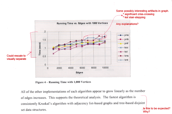
This
sample has some artifacts that could be interesting,
but are not explained.
- The
lines criss-cross in several places. Because
the lines are always close together (i.e., within
a small percentage of each other), the authors
might validly consider the crossing behavior
to indicate insignificant noise. If so, the argument
should be made and referenced to the margin of
error of your timing mechanism. Also, was the
same data used for each algorithm? It should
be, for consistency.
- The
data exhibits significant stair-stepping. This
is typically a result of either the algorithm
or memory hierarchy issues.
|
| Sample
4 taken from student paper |
 (Click on images to enlarge)
 |
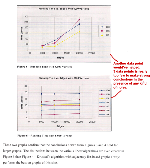
|
Explanation
of issues and suggested improvements for Sample
4
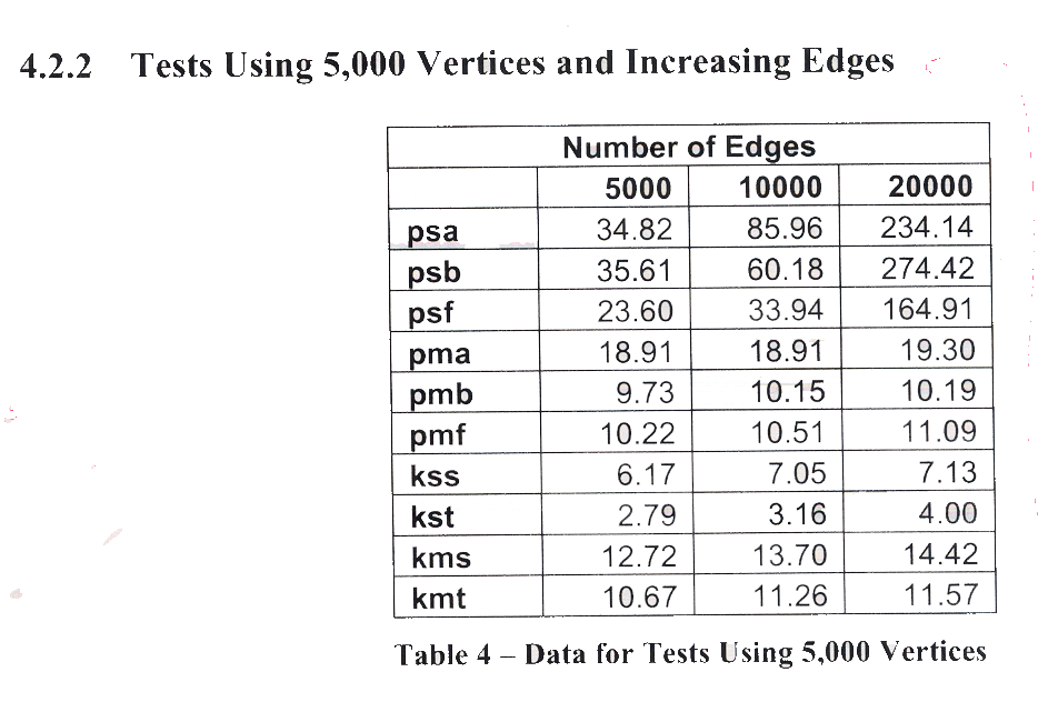
The
table and associated figures shown above have two
problems.
- Only
three data sizes are used, an insufficient number
to draw strong conclusions about trends
- While
the authors correctly state that the data confirms
the expected conclusions, they should be more
explicit and say, for example, that this illustrates
that pmb is consistently faster than pmf, which
is consistently faster than pma, as expected
from the algorithms' descriptions. However, it
is somewhat surprising that kmt isn't consistently
faster than kms. The paucity of data, however,
makes it hard to say how consistent this behavior
is.
|
|
|
|


;)
;)